Early Development Ideas: Zeku
Demon Slayer Ver.
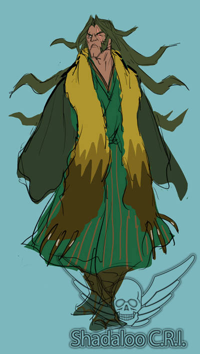 First, we had to figure out Old Zeku's design.
With this idea, Zeku is a savage demon slayer. And as the successor of Bushinryu slaying demons comes with the territory. The highlight of this design is the pelt he's sporting. A trophy from a giant-sized weasel that he defeated.
Kempo Master Ver.
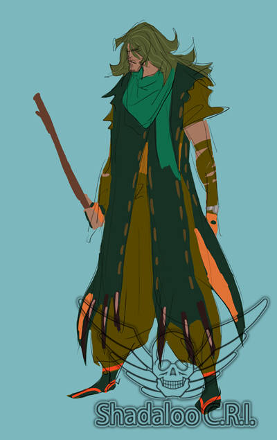 He fights with a broken-off stick that he picked up along the way. He's adept at picking up the random items and turning them into make-shift weapons. He can also use the stick to juggle and toss around giant enemies with ease.
 Kunai Sash Ver.
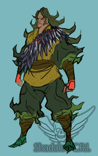 He's wearing a sash with a countless number of kunai. Around this time, we had this nutty idea that he was a comic book artist who was also the Bushinryu successor. (It's probably because the tip of each kunai looks like a fountain pen, but let's keep that bit of info between us here.) Luckily, this idea didn't last.
 Demon Slayer - Young Zeku Ver.
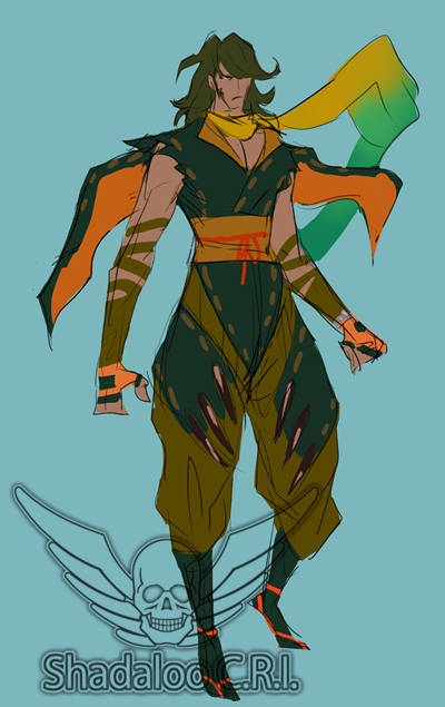 Here we can see the Young Zeku version of the demon slayer idea. Notice the lack of a mask. The coloring is quite bland overall, and we wanted to make him stand out more. Unfortunately, we don't have many rough sketches for Young Zeku.
Briefly Finalized Ver.
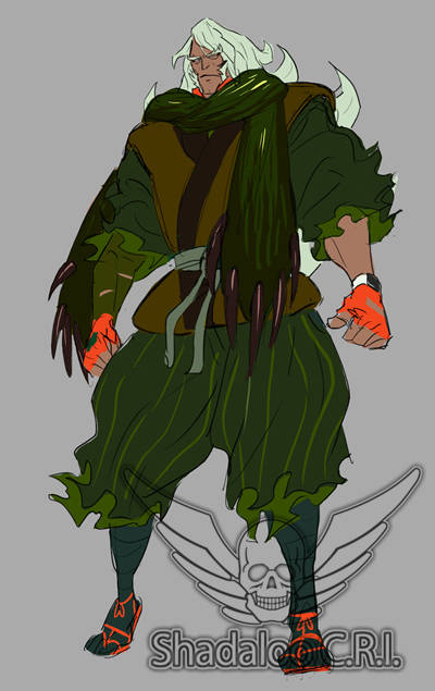
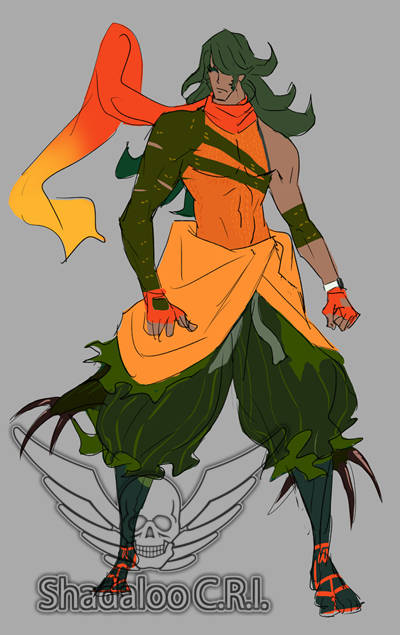 This was around when we decided that Old Zeku would be jovial, and Young Zeku would be more serious. In this design, we kept the giant weasel idea and added a pretty flashy scarf. Initially, we decided to go with this design, but ended up feeling that it was still lacking a sense of surprise. After trying out various ideas, the finalized version of Zeku came into being.
 Rough Sketch of Young Zeku
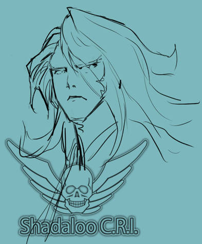
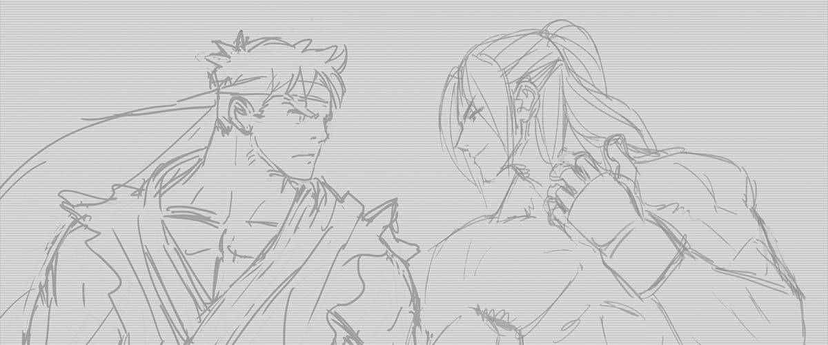
From being the Bushinryu successor, and Guy's master, to his love of wristwatches and potato chips, not to mention being able to change into his younger self, we had plenty of ideas to work with when creating his design. Some of the themes we were going for were - "sort of silly, but a professional when it comes to work" and "a nice old man." Personally, I'm a fan.
See you next time!
Takayuki Nakayama






 PlayStation および
