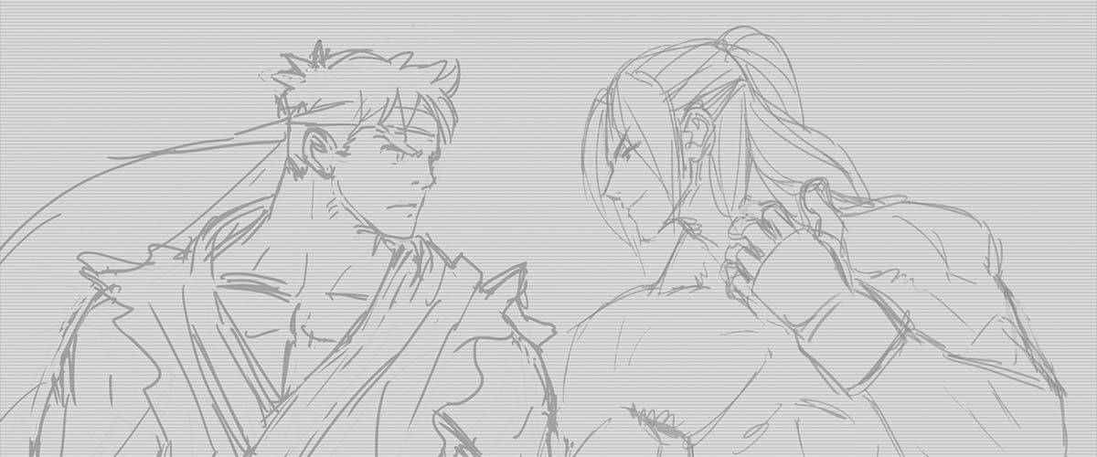


The Cutting Room Floor
Hey everyone, today we're going to take a look at some of the ideas we had for Street Fighter V's logo.
I don't think you've ever seen failed concepts for logos for any other game before, right?
Well, around these parts we try to do new and unique things!
I don't think you've ever seen failed concepts for logos for any other game before, right?
Well, around these parts we try to do new and unique things!
Concept 1
 We had this idea of using energy trails for the logo.
It looked pretty nice and had that oomph you'd expect from a fighting game logo, but you can't read what it says...
Concept 2
 Much easier to read, but it was too wide.
It still looks good to me, though.
Concept 3
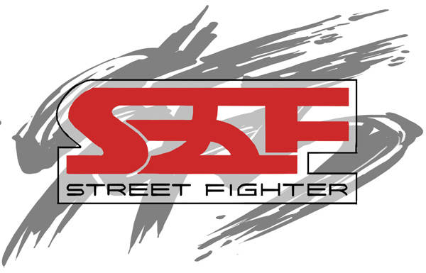
 Here we based the logo on the SFV acronym.
But we felt it resembled Street Fighter IV's brush stroke effect too much, and we didn't like using the acronym in the official logo, so we set this aside.
Next!
Concept 4
 The second logo based on the acronym.
The F looks like a Japanese "5", but it was a nice, fresh design!
But... cut!
Concept 5
 A vertical, Japanese-style logo concept, complete with katakana and hiragana.
Obviously we can't use this around the world, so we ditched it.
I did like it though, so I'm using it in the Character Guide section.
Concept 6
 This was pretty close to becoming the official logo.
The V in the background is spread out evenly and looks very nice.
The letter layout was also getting close to what would be the final logo.
It looked pretty nice and had that oomph you'd expect from a fighting game logo, but you can't read what it says...
Concept 2
It still looks good to me, though.
Concept 3
But we felt it resembled Street Fighter IV's brush stroke effect too much, and we didn't like using the acronym in the official logo, so we set this aside.
Next!
Concept 4
The F looks like a Japanese "5", but it was a nice, fresh design!
But... cut!
Concept 5
Obviously we can't use this around the world, so we ditched it.
I did like it though, so I'm using it in the Character Guide section.
Concept 6
The V in the background is spread out evenly and looks very nice.
The letter layout was also getting close to what would be the final logo.
And that's it!
We have a lot of other logo designs but we might show off some of them at a later time.
The logo of the game is actually really important; deciding that at an early stage let our staff understand what kind of direction we're going with the game.
Takayuki Nakayama
We have a lot of other logo designs but we might show off some of them at a later time.
The logo of the game is actually really important; deciding that at an early stage let our staff understand what kind of direction we're going with the game.
Takayuki Nakayama
 PlayStation および